Day 20 – Refine an Idea

Image

From A Distance.

IMG_2559
This was my original photo for ‘From A Distance’. On the day, I wanted to go out and take a photo in a field or something of a far away tree but didn’t have anywhere to go so I took this one. I don’t really like it because although, it has some nice compositional features, it doesn’t fit the theme of ‘from a distance’. So I have taken today’s title of ‘Refine an Idea’ as an opportunity to redo this idea.
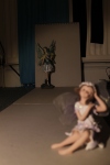
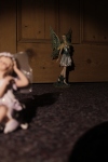
_MG_2999 _MG_3000 _MG_3002  < Test shots

These are my test shots. The first one was in my bedroom and I set up card for a plain background but I wanted to be closer so I moved the front fairy further back. The second photo is better but not framed very well. For the third one, I went out in the hallway and used my wooden door for a nice background. It’s much better but the lighting was from the left side which was not as effective as from the other side (on final photo, below). However on that picture, I do like the shadow framing on the top and the way the shadow of the front fairy points towards the back one.

_MG_3001

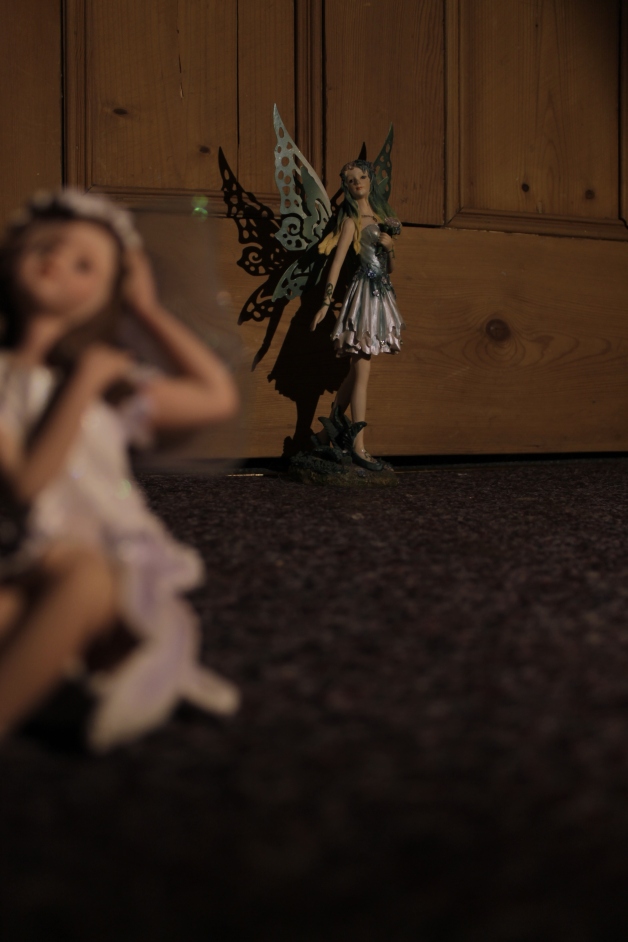
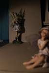
This photo works well because I lit it up with a lamp from the right side. This has made a really nice shadow of the background fairy’s wings. Also, the photo fits the distance theme because I have used the technique of a shallow depth of field to put emphasis on something that is in the background. The camera was on aperture priority to get this effect and I used auto focus but put the square on the screen onto where the back fairy was so it focused on that one and made the one in the foreground blurry.

Regarding narrative, I think this photo does tell a story because the fairy in the background looks a bit more important in her pose and with her big wings etc. Whereas the one in the foreground was smaller and sitting down. This is why I positioned them in this way because the one in the back looks like she is showing off more.

Day 13 – Depth (1)

Image

_MG_2626 edit

Date taken: 5/2/13
Location: Spiral staircase in college
Settings: Shutter Speed: 1/15 | Aperture: f/4.5 | ISO: 800

I really like the mixture of curved and straight lines in this photo. The spiral of the banister on the the stairs lead your eyes to the vanishing point in the centre of the image which is the bottom of the staircase. I took the photo from the bottom looking up because I liked how smooth and light the surface was underneath the stairs. I wanted to capture physical depth as when you look down the spiral, it definitely gives a sense of depth and bottomlessness!

_MG_2614

This was a photo that I did not use because it was a bit blurry due to camera shake. Also, I don’t really like the angle I took it from. I prefer the final photo because the straight, symmetrical angle gives more depth and looks better with the inner circle right in the centre. Also, this one was taken from the top looking down and I think some of the colours on that side are a bit distracting and take away from the effect of being drawn in. Although it might have looked better if I edited it, adjusting curves and colour balance etc.

Cap 1
Screen shot of editing curves to add contrast.

Cap 2
The original photo had some beige colours so I enhanced these by editing the colour balance. To make the photo more golden/yellow, I put more yellow in the highlights, some red in the shadows and a bit of both on the midtones.
Capture1
I added a black and white radial gradient fill on another layer (blending mode: overlay). This made the outer edges of the image a bit darker and helped with the framing.

Day 12 – One Point Perspective

Image

IMG_1420

Date taken: 12/10/12 (Edited: 5/2/13)
Location: Railway
Settings: Shutter Speed: 1/125 | Aperture: f/7.1 | ISO: 200

I like the photo above because your eyes follow the train tracks to the vanishing point in the centre of the image. One point perspective photographs have a good narrative because they make you wonder what is at the end beyond the vanishing point. This image is effective because it seems as though you are on the tracks looking towards the horizon. I stood in the middle of a bridge to take the picture so that all the lines came together with a  vertical symmetry.

I took the photo in black and white with a red filter to bring give it more contrast, and I edited the levels as well later on. I also used the sky editing technique that I learned on ‘Day 9 – A Photoshop Tutorial’ because the sky on this was a bit overexposed. Instead of using a blue gradient, I used grey to fit the black and white image.

IMG_1420 chloe

Here is another one point perspective photo where I have pasted a picture of a girl on the train tracks. This photo was made to create a surreal effect and play with the idea of scale as the girl looks like a giant. I like the way it’s not just a landscape photo with this one and I have used the one point perspective technique with a portrait. The lines lead you to the vanishing point behind the girl and give her more importance.