Day 30 – Self-Portrait

Image

lol eye

Date taken: 22/2/13
Location: Bedroom
Settings: Shutter Speed: 1/25 | Aperture: f/5.6 | ISO: 400

This is my self portrait and I took it right by the window so that I had enough light. I made it by adding two photos together and super imposing the eye from another photo onto the other picture of me. I enlarged the eye and used the transform tool to rotate it slightly. Then I used the erase tool to get rid of the edges and blend it in. I like it because I have created an abstract photo by making the eye look bigger than it should and it makes me look like a bug! I think the composition works because without the big eye the photo was a good portrait as I took it of just half my face which is already an interesting picture and you wonder what I am looking at. With the weird eye on top it adds something else and really changes it because it looks a bit scary with that big googly eye staring at you..

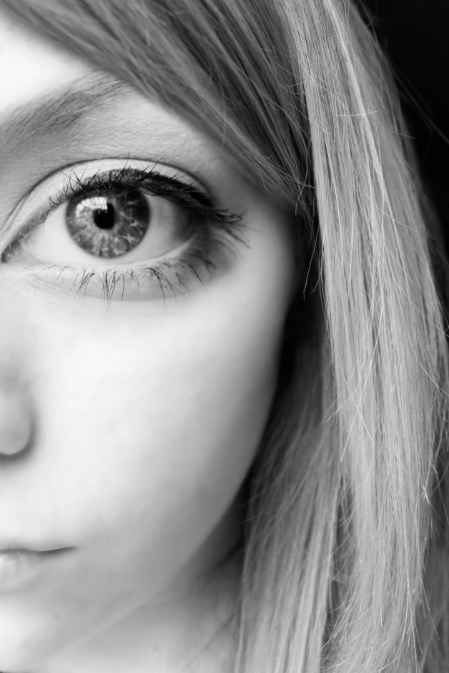
These are the two original photos that I used:

_MG_3588 edit _MG_3597

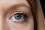
You can see that on the original picture, I’m looking in a different direction so putting the eye that looks straight forward onto it adds to the weirdness. The first photo was taken in colour and the second was in monochrome with a purple filter. In Photoshop, I desaturated both to make them blend together more easily. I edited the curves on the eye image making it lighter to match the other image.

Another thing I edited was the blur round the face and hair. I used the quick mask to select the area where I wanted the gaussian blur:
screenshot

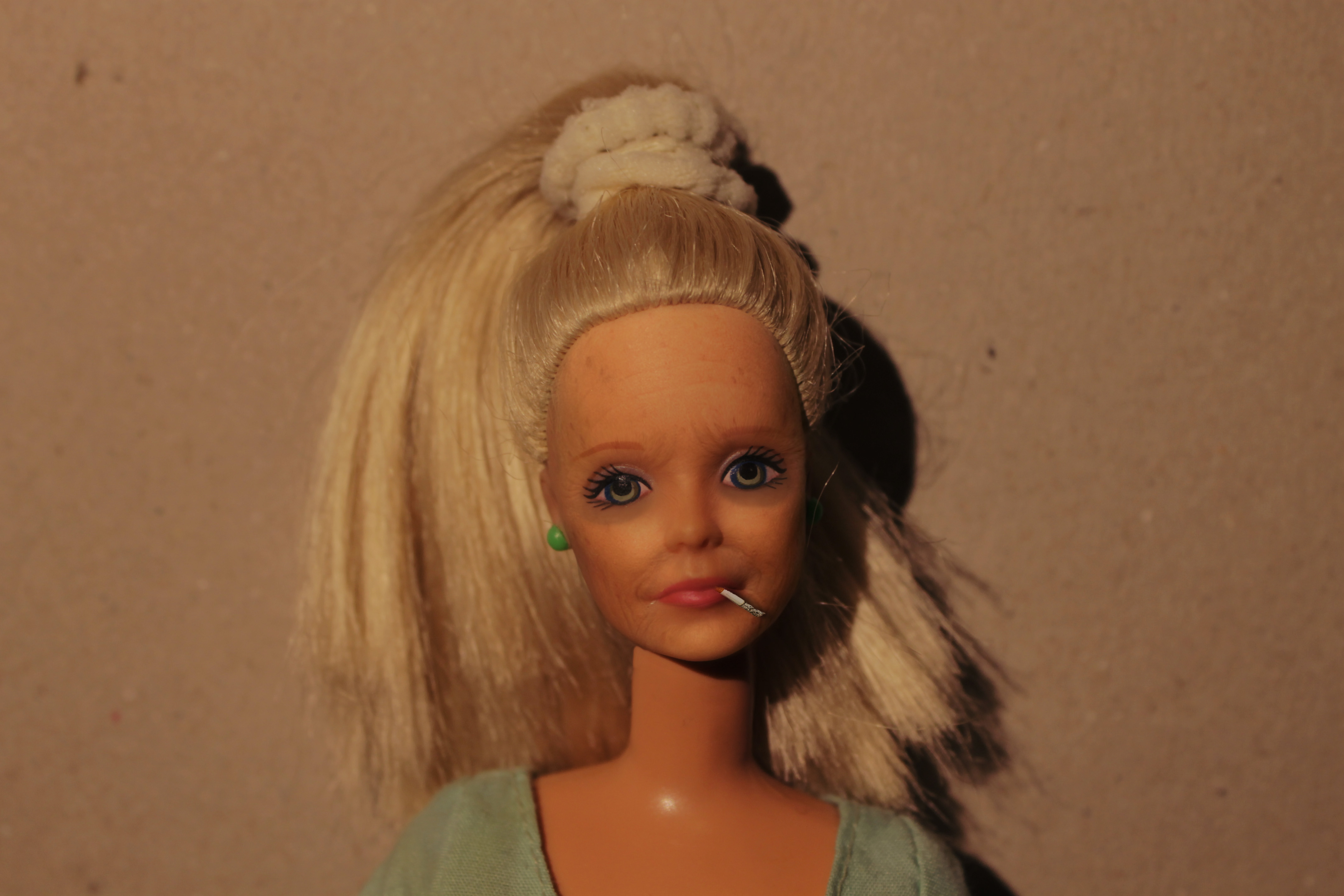
Other self-portrait experiments:

BLEH warped face blah

For those images, I was experimenting with Photoshop techniques such as duplicating layers, the transform tool, adjustment layers, the warp tool, blending modes, gradients and also with compositional elements like symmetry.

Day 18 – Ugliness

Image

_MG_2975 edit

Date taken: 13/2/13
Location: Bedroom
Settings: Shutter Speed: 1/25 | Aperture: f/5.6 | ISO: 200

For ‘ugliness’ I wanted to take something that is supposed to be beautiful and make it ugly. I took a portrait of a barbie and made it look older and not so happy on Photoshop. I also added a cigarette in her mouth.

How I did it:
Changed levels for more contrast
On a new layer, used the brush tool on an opaque brown colour to darken the eye area
Liquify filter to make the face more droopy (dragged things like mouth, cheeks, eyes, eyebrows and made neck larger)
Added image of cigarette, cut it out with the quick selection tool, ctrl + T > perspective, drop shadow
Added image of wrinkled woman’s face (google images), opacity 32%, fit to barbie’s face (ctrl + T and warp), erase edges
Added layer and filled with orangey colour on top of wrinkles layer to match skin tone to barbie’s skin using brush tool and blending mode ‘Soft Light’

I like the end product because I achieved my goal of making something nice look not as nice. I could have spent more time editing and perhaps adding other, more typically ‘ugly’ features but I am happy with how it is now. I like how the image now looks more sad now that barbie is not smiling and her eyes look aged. The peachy filled layer I added on top has given the photo sadder feel as well and makes it look like an old photograph.

before and after < Before and after.

Day 12 – One Point Perspective

Image

IMG_1420

Date taken: 12/10/12 (Edited: 5/2/13)
Location: Railway
Settings: Shutter Speed: 1/125 | Aperture: f/7.1 | ISO: 200

I like the photo above because your eyes follow the train tracks to the vanishing point in the centre of the image. One point perspective photographs have a good narrative because they make you wonder what is at the end beyond the vanishing point. This image is effective because it seems as though you are on the tracks looking towards the horizon. I stood in the middle of a bridge to take the picture so that all the lines came together with a  vertical symmetry.

I took the photo in black and white with a red filter to bring give it more contrast, and I edited the levels as well later on. I also used the sky editing technique that I learned on ‘Day 9 – A Photoshop Tutorial’ because the sky on this was a bit overexposed. Instead of using a blue gradient, I used grey to fit the black and white image.

IMG_1420 chloe

Here is another one point perspective photo where I have pasted a picture of a girl on the train tracks. This photo was made to create a surreal effect and play with the idea of scale as the girl looks like a giant. I like the way it’s not just a landscape photo with this one and I have used the one point perspective technique with a portrait. The lines lead you to the vanishing point behind the girl and give her more importance.